Laquered Up Polyensian Paradise Swatches and Review

Hello Lovelies!  I am so excited to share this collection with you today.  I have been trying to throttle back on how much polish I buy, but I just could not pass up on this gorgeously bright collection.  This neon collection is full of silver flakies, which makes it absolutely irresistible.


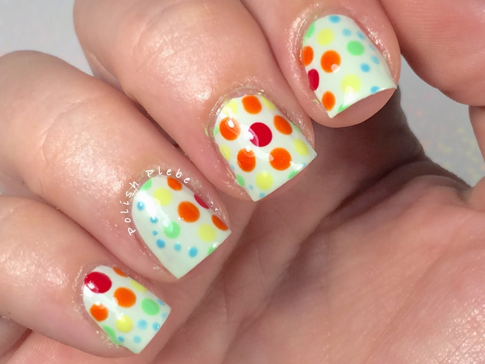
This is the brightest pink I have ever had the pleasure of owning.  As soon as I received my order in the mail I had to try this on.  It was nearly opaque in one coat, but I did two coats just to be on the safe side.  I have been wearing this polish for most of the weekend, and I just can't stop starring at it.  It is just so pretty.


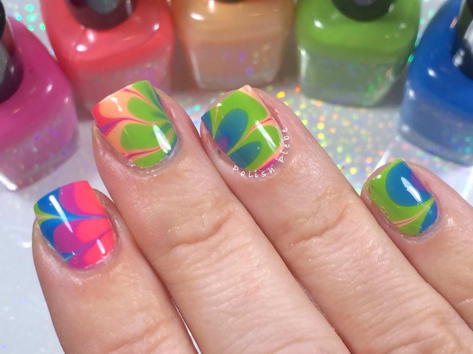
All of these photos are shot outdoors, except for the brush macro.  This collection is just to gorgeous to shoot under lamplight. All of the photos you are about to see are in natural light.  Unfortunately, because the clouds weren't cooperating some are in direct sunlight and some are indirect sunlight.


I don't own many oranges and especially none as bright as this.  Of the entire collection this was the most translucent polish, with an almost jelly like application.  However, it was still completely opaque in two coats.  The silver flakies are so reflective they appear to be gold because of the orange.


I've said before and I'll say it again, green is the most under-appreciated polish color there is.  Fiji is so impressive that you can't look away from it.  This is the absolute brightest green I have every seen anywhere.  Mostly opaque in one coat but swatched with two for good measure.  I feel like I need to wear sunglasses to look at this polish.


I've always wanted to visit Hawaii, so I'm glad my favorite color is named after such a gorgeous place.  This blue is so much more than your typical blue polish.  It is so packed full of silver and blue flakies, that I'm not even sure there is a base color, or if it is entirely made up of flakies.  Also very opaque but swatched with two coats like all the others.


This is probably the most subtle color of the collection, yet it has the most wow factor.  Oahu is a paler shade of purple that is bright and crammed full of silver and blue flakies.  Similar to Tahiti in that it was almost jelly like in opacity but gave full coverage in two coats.  This was the color I was least interested in of the whole set but has quickly become one of my most favorites.


This is my second experience with Laquered Up, my first was when I purchased the 7 Tales of Luck and Whiskey Collab Set back in March.  She contributed a fun St. Paddy's Day glitter that was very fun.

I himmed and hawed over purchasing this collection for a while because I knew I liked her polish contribution from the Collab set but had never made an individual purchase with her before.  I am so incredibly pleased with this set, the polishes, and my experience.  I would purchase again from Laquered Up polish in a heart beat.  Her prices are reasonable, the shipping was phenomenally fast, I received my new polishes two days after placing my order.

And the polishes, the polishes are absolutely fabulous!  As you can see from the pictures they are fantastically bright, full of pretty shimmery flakies.  The formulas are perfectly opaque, and the polishes application was so incredibly smooth.  I highly recommend if you haven't tried this indie brand that you give it a try, I highly doubt you will be disappoint.  I hope you enjoyed these beautiful swatches, and found the review useful.  Thanks for stopping by, see you next time.

Your Fellow Plebe,


Fading Lines

Hello Lovelies!  Today, I have a nail art design for the last prompt of May's Freehand IG challenge.  The prompt is simply favorite color, and anyone who has read my blog or knows anything about me, knows that my favorite color is blue.  I decided to use two of my favorite blue Color Club polishes, along with my favorite technique, and pattern to create this look...


Materials I used:
Base coat - INM Ridge Free
Light blue - Color Club 'In De-Nile'
Dark blue - Color Club 'Nail Robi'
Ellagee 'Lickity Split Latex Mani Mask'
Make up sponge (not shown in picture below)
Striping brush
Top coat - Rica 'Glossy Glam'

 
I prepped my fingers with my ridge filler base coat, I always use a base coat to minimize nail staining.  I really like this base coat because unlike other ridge fillers it isn't thick, yet it still gives my nails the smooth surface that usually takes a significant amount of buffing for me to obtain without a ridge filler.  I also applied a liquid latex mask, to help with the clean up process. 


For this post I decided to bring back using my left hand so that you can see the progress it is making since I broke most of my nails on this hand a couple weeks ago.  As you can see they are still a bit nubbly, uneven, and I have a couple of weird corners.  However, they're making a strong come back so far, so I thought I would encourage them by letting them show off this post.

I began this design with a gradient, currently my favorite nail art technique.  I decided to use what I am referring to as the quick gradient method.  Instead of using a white or light colored base I started off with painting my nail half of each shade.  I reversed the color order on each nail to make it a little more interesting.


Then using a make up sponge (like you do), I blended the colors in the manner you do with a traditional gradient design.  The hardest part about this was remembering to flip the sponge so that I didn't ruin my color pattern.


At this point I removed the mani mask and performed a little bit of clean up before proceeding to the freehand portion of the design.


Since, this is for the Freehand IG Challenge I had to do something freehand for this nail art so I decided to go with my favorite pattern, vertical stripes.  Using a striping brush, I used my two blue polishes and striped three stripes on each nail, alternated between the light and dark across all my nails.


I performed a final bit of clean up with acetone and a brush, and applied my shiny top coat.


The final result is a neat monochromatic blue fading stripe design.  The stripes appear to fade in and out of the gradient, which I think is a pretty cool affect.  I would have preferred to use striping tape to create cleaner lines, but it was good to practice my freehand stripes.


I'm so excited that I completed another challenge!  As I said before, I really enjoy the Freehand IG Challenge, its a great motivator to practice my freehand skills.  I really hope they do it again in June, and I hope you all decide to join in.  If they post a June challenge I will be sure to share it with you here, that way if you're not on Instagram you can still join in.  If you are on Instagram, please check out my account and follow me if you aren't already, I post nail mail, works in progress, and some personal pictures there.


I post on many different social medias and share with a few different nail art communities.  If you would like to follow me or see where I hang out online check out my 'About Me/Contact Information' page to see my channels and links so that you can find me easier.  I appreciate each and everyone of my followers on all my networks, your likes, kind comments, and even page views put a smile on my face.  Thank you so much for stopping by, see you next time.

Your Fellow Plebe,


Radial Dots

Hello Lovelies!  I hope everyone had a long and lovely holiday weekend.  I had intended to do some patriotic nails for Memorial Day but the weather was so nice that I never got around to actually creating them.  I'll save that design for the Fourth of July.  I thought I would do a simple dotticure nail art to get me back on track...


Materials I used:
Base coat - INM Ridge Filler - I typically use Seche Vite, but that's because I buff my nails smooth.  I have a significant problem with ridges but my nails are so weak lately that I am trying to avoid buffing them.  Using a ridge filler base coat helps smooth out the nail without damaging them.
Base color - Color Club 'Sweet Mint'
Dot colors - Color Club 'Frozen Daquiri,' 'With the Cabana Boy,' 'All Inclusive,' 'The Islands,' & 'Sea-ing Blue'
Various dotting tools
Top coat - Rica 'Glossy Glam'


I had initially planned this with a white base color, but I use white so often that I thought I should change it up just a little.  So I decided to go with this incredibly pale green from the Shifting Into Neutral collection.  I purchased this collection a while ago, but never actually swatched it.  This pale green has just the oh, so slightest shimmer.


 I began my pattern on my mid finger with a large dotting tool I placed one dot in the center of my nail.  I then used a smaller dotting tool and dotted around the single large dot with my next color.  I repeated the process, using a smaller dotting tool with each round. 


For all other fingers I used the same pattern but shifted the pattern to the left, right, top and bottom of each nail.  The only thing that is more noticeable on my other nails is that there is a round of teeny tiny blue dots that traces the outside of the radial.  There are some blue dots on my mid finger but you can't seem them that well.

As always, I performed a bit of clean up with some acetone and a brush, then applied my favorite top coat.  I love how a nice top coat really smooth's out the design and gives a really nice shine, don't you?


This design didn't turn out the way I imagined it would.  Its one of those cases, where it looked better in my head, but its not the worst design I've ever done.  I feel this is one of those times where its just a little too much.  I really should just stick with the philosophy of less is more.


The more I look at this the more it reminds me of one of those color blind tests, not what I was going for but interesting, none the less.  Next up, I have planned my design for the last Freehand IG challenge from May, so stay tuned.  I hope you enjoyed this nail art design, thanks for stopping by, see you next time.

Your Fellow Plebe,


Watermarble Practice

Hello Lovelies! Yesterday I decided to practice watermarbling.  This is a nail art technique I am far from mastering, but I love it so much that I really want to get good at it.  I decided to use some Zoya nail polishes that I have used in the past.  Most things that I have read about watermarbling says that it is best to use new polishes.  However, these polishes are about a year old and I used them because the colors seemed right for the season and I have had some success with them in the past.


I used Zoya 'Rooney,' 'Wendy,' 'Cole,' 'Tilda,' and 'Ling' (shown from left to right).


I used a white base coat this time around, the first time I used these polishes for watermarble I did not use a base coat (it was my second time watermarbling, ever).  This is two coats of Color Club 'Blank Canvas.'  As you can see I wasn't too concerned with perfection here.


I created a three layer bulls-eye with my Zoya polishes.  I use bottled water when doing watermarble because I have hard water.  My tap water has so many minerals that the polishes just will not spread in it.  Bottled water works wonderfully and I leave it with my nail art supplies so that it is always at room temperature.  Your tap water may work just fine, but if you are having a problem with getting the polishes to spread try bottled water.  This time around I attempted to create a flower-type design by pulling in toward the center.  I then dipped, aiming to capture the petals (I used a liquid latex mask on my skin, the purple stuff, to help with the clean up process).  Clean the surface of the water with a q-tip while your finger is in the water.  Remove your finger slowly once the surface of the water is clear of polish.


Seems really easy, doesn't it?  I spent almost the entire day working on this.  I had so many problems, from the polish drying too quickly to accidentally knocking the cup and destroying patterns.  For me this is such a frustrating nail art technique, but the results are so pretty.


Even though it's not perfect I do like the colors, and it turned out well enough to present to you.  You can see some of my white base showing through in some spots.  This was caused by air bubbles that occurred during the finger dipping process.


I was also getting frustrated because I couldn't get the petals small enough to fit them on my nails exactly the way I wanted them.  I settled for them being a little larger and spaced further apart.


All in all, I like the way this watermarble design turned out.  Zoya crème polishes work really well for me when trying to do watermarble and the white under-coat really makes the colors pop.  This is a great summer time color scheme, I'm feeling ready for the beach and sun.Thanks for stopping by, see you next time.

Your Fellow Plebe,
 

Nails Art Proudly Powered by Blogger