Zoya's Spring 2014 Awaken Collection Swatches and Reviews

Spring has sprung and no other collection represents Spring as well as Zoya's Awaken Collection.  This collection consists of two soft creams and four polishes that have Zoya's signature sparkle.  

When do these swatches and reviews I usually like to comment on the formulas of each polish individually.  However, I am going to comment on all  the formulas of these six polishes right know, in one word they are perfect.  If you have read my most recent reviews on two other Spring collections I purchased you may have noticed some disappointment.  I seem to have poor luck with finding pale polishes with good formulas.  Well, I think my search is finally over.  With all these polishes even the two light colors I did not need more than two coats to get the perfect look.  On some of the darker colors I could have gotten away with one coat but decided to do two just for the sake of it.  So all the pictures below are with two coats of polish.

I am happy to present to you Zoya's Spring 2014 Collection, Awaken.


Dot ‐ ZP720

This is the perfect shade of pale pink.  It's a really nice cream with a beautiful shine.  This color is absolutely dreamy.

Cole ‐ZP721

Orange is a color you either love or you hate, but this one is a must have.  It is soft yet bright.  Between the cream finish and the color this one reminds me of orange sherbet.  Yummy!

Brooklyn ‐ ZP725

When I first saw this color I wasn't really sure if I liked it.  I was really surprised by how beautiful this color was once I put it on.  This is a yellowish gold color.  The signature sparkle that I've come to recognize as Zoya really makes this color sparkle like  the sun.  For some reason this color makes me think of Greek goddesses basking in the sunlight.

Dillon ‐ ZP723

This is a really interesting shade of green.  This color is a light to medium green that is strangely bright yet somehow earthy at the same time.  I think the color gives it the earthy look while the Zoya sparkle brightens it up.

Rebel ‐ ZP724

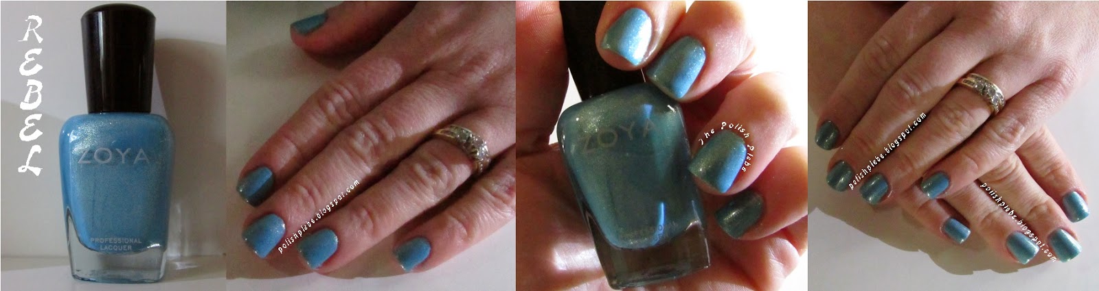
This color is simply fun!  If you haven't heard me say it before, well I'm going to say it again, blue is my favorite color.  This one is fantastic!  This medium blue is very energetic and super cute!  

Hudson ‐ ZP722

This color is also fun!  This medium shade of purple is very pretty on its own but Zoya added that sparkle that really gives it its WOW factor.

If you couldn't tell, I love this collection.  The colors just scream SPRING!  The creams are just the dreamiest and the metallics are so eye‐catching.  The formulas are fantastic, you really can't ask for anything more.  Though I haven't tried all the Spring collections out there I have to say, if I had to pick just one out of the ones I've tried so far, this collection would be it.

Need some inspiration for your Spring Awaken manicure, try one of these on for size

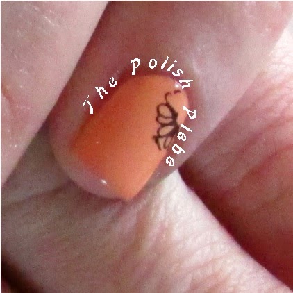
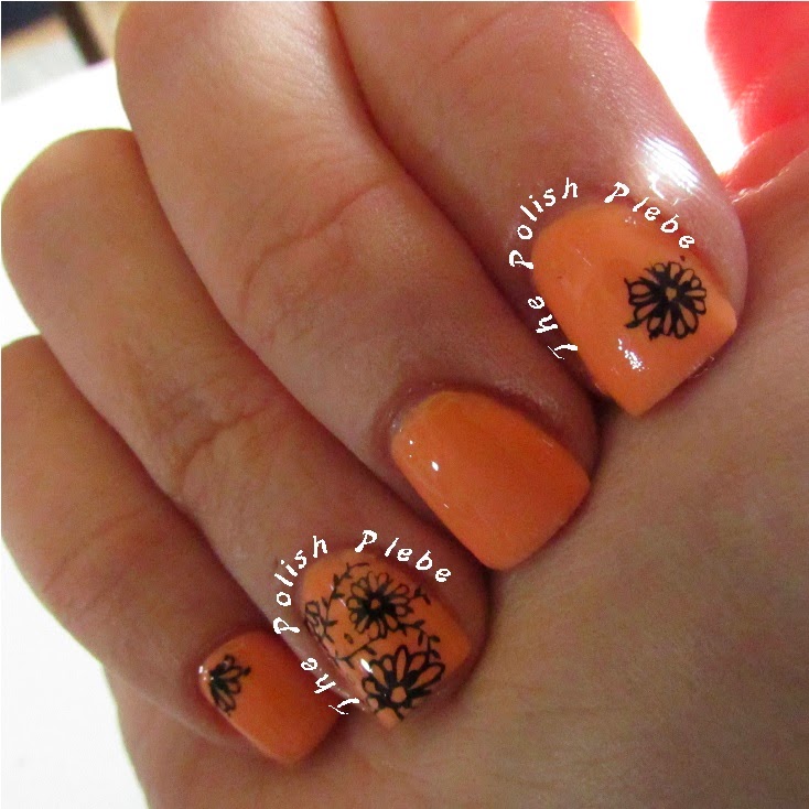
You may recognize this its from my previous post "Stamping into Spring".
I used a floral image and stamped it in black over Cole.
Here is a simple angled half n half mani using Hudson over Dot.
I couldn't make up my mind on this shifting stripes manicure.
On the left is Rebel over Brooklyn and on the right is Brooklyn with stripes painted in Rebel.

If you've got a favorite let me know in the comments.  I hope you are enjoying your Spring so far.  
Until next...

Your Fellow Plebe,


#Zoya Awaken #Spring 2014

Stamping Into Spring

So, a little while ago I picked up some image plates, a stamper, and scraper.  I was so excited because I've seen so many images of beautiful nail art using stamps.  Everyone including the lady who sold me the image plates have made it look incredibly easy.  Well, I'm here to tell you it's not as easy as it looks.  I have tried on a few occasions to stamp, the first two attempts ended in frustration.  But I think I figured out why I was having such an issue, on my third attempt I finally achieved a good look.  Though its not perfect it's still much better than the first two.  I was really determined to do a spring manicure using a floral image plate that I found.  I'll just preface this tutorial with a warning that the pictures used in this post are from all three attempts, so you'll see various colors used in the manicures.

Material
Base and top coat
Base color polish
Stamping color polish (you can purchase stamping polish but almost any polish will work)
Image plate  ( I used Konad M61)
Stamper
Scraper
Toothpick (optional)


The Application Process
After applying your base coat and base color give your polish a little time to dry.  

I used Cole from Zoya's Awaken 2014 Spring Collection
Dab some polish on your image plate.  You don't need to use stamping polish but I do recommend using thicker polish.  On one of my attempts the polish was to thin and I couldn't pick it up with the stamper. Also, keep in mind that some polishes may not give you a crisp clean design.  I found that some of my polishes weren't as opaque as I thought and so the stamped images looked kind of dull.
A little dab'll do ya.

Using a scraper, scrape the excess polish off the image plate.  If you use too much polish you may have to scrape a couple of times.  You really don't need much polish.  I also recommend you work over a paper towel because this can get really messy.

Scrape to the edge, not into another image.  This will save
you some clean up.
Using the stamper pick up the image.  Press the stamper firmly over the image to transfer it from the plate to the stamper.

Pick up the image by pressing the
stamper firmly over the painted image.
With the image on the stamper, transfer it to your nail.  It is best to start at the edge of the nail and roll your stamper over the nail from left to right or vice versa.  If your not comfortable with rolling the stamper, you can also hold the stamper in place and roll you finger instead.  I used both techniques and found both to be easy.

Start on one side of the nail and roll it across to the other.

When you are done be sure to clean your image plate and stamper before using it again.

Use a cotton swab and some acetone
to clean your image plate.
If you have a full nail image and you wish to use only a part of it you can do so pretty easily.  Once, you have an image on your stamper you can use a toothpick to scrape away parts of the image that you don't want.

For a partial image use a toothpick to scrape away parts that you don't want.
Tips, Tricks, Recommendations
Seems easy doesn't it, well hopefully you have had or will have a better stamping experience  than I have. Here are a few tips, tricks, and recommendations I have to make your stamping experience an enjoyable one.

  • If you are using a polish you've never used before to stamp with try it out on a practice nail or a piece of paper before applying it to your painted nail.  This will allow you to see the opacity of the polish and how well the design will show up.
      On my first stamping attempt I used a black polish I had never used before.
    It wasn't as black as I thought it was.
  • Use heavy contrasting polishes for your base color and your stamping polish color. This really makes your image standout.

On this attempt I tried a purple polish to stamp with only to realize that there
wasn't enough contrast to see the stamp.

  • Make sure your stamping polish is thick enough so that the stamper will pick it up.
  • Work quickly, this is not really a process that you can take your time with.  I found that if I wasn't quick enough I couldn't pick up the image with the stamper.  I would recommend staying away from quick drying polishes unless you have lots of practice with stamping.
  • I found that it was easiest to transfer the image onto a slightly tacky painted nail.  The first time I tried stamping I painted my nails a day in advanced and had used a top coat on the finish.  The stamp wouldn't stick to the dry top coat and flaked before I was even finished stamping.  The second attempt I also used a top coat and drying drops on the finish before trying to stamp.  On the third attempt I painted my base color and waited until they were tacky.  This seemed to work the best, however, you don't want your finish to be too wet otherwise you'll ruin your base color when stamping your image.
  • I also had some issues with my cuticles getting in the way.  I know that sounds weird.  I have rigid deep cuticles this prevented me from getting a really clean stamped image close to my cuticles.  I don't have a solution to this but it is something you should keep in mind.
On my pinky my cuticle got in the way and part of the image
wouldn't transfer
  • Lastly, apply a top coat.  This both gives the stamped image a shiny finish as well as helps seal the image.

Before topcoat (left) and after top coat (right).
The top coat really adds a nice shine as well as makes the design look crisp.
This is what I finally achieved after a few attempts.


I would recommend that you start with a small image if you've never stamped before to get the hang of the technique before trying a full nail image.  Unfortunately, I didn't take this advice myself (I'm one of those go big or go home type of people).  I hope this helps you in your stamping endeavors.  Have fun stamping your way into spring! 


Your Fellow Plebe,

OPI's Muppets Most Wanted Collection Swatches and Reviews


The Muppets are back and they are going on a World Tour!  Disney and OPI have teamed up once again to bring us an awesome collection.  This collection has something for everyone, it has both light and dark shades, and glitter lovers they didn't leave you out.  This collection offers three fun new glitters, that are fun, unique, and pair up nicely with the colors in the collection.  I decided to introduce this collection by colors light to dark, and then the accent polishes. Without further adieu here is the review.


I Love Applause ‐NL M77
This is a super pale shade of pink very reminiscent of Miss Piggy herself.  The formula on this polish was not good at all.  I tried to get away with three coats and ended up doing four to get the desired result.  I was surprised because the few other OPI polishes that I have are much better than this.  I would highly recommend priming with a white polish before applying this color.  Though the formula was a big disappointment this color is a great spring color.  I can see myself using it in some floral nail art designs very soon.


Chillin' Like a Villain ‐NL M82 
This is a cute pale peach color that will also be great for spring.  Unfortunately this formula was very disappointing as well, taking three coats to get the desired look though I probably should have used a fourth.  From my limited experience with polish I've noticed a common trend with light polishes being very thin.  Has anyone else noticed that?


Miss Piggy's Big Number ‐NL M76
Blue is my favorite color and this one is beautiful!  It is a very royal blue with just a hint of violet, and slight shimmer.  The formula on this color was much better than the previous two requiring only two coats to get the desired look.  This color is very glamorous, just like Miss Piggy herself.


Kermit Me to Speak ‐NL M79
This is the color that made this collection so enticing for me.  This color is very dynamic and has many different facets.  The formula was not what I expected from OPI taking me three coats, though I probably could have gotten away with two if I had been more generous during the application.  This color is awesome though and difficult to describe it is a shimmery pale purple almost mauve‐ish color, but in different lighting it picks up shades of gold and green.  I really don't feel pictures pick up all the beauty this color has to offer.  


On to the glitters!  The glitters in this collection pair up with the colors very well and I found that even though each glitter paired up with a particular color perfectly, they also went along with all the colors.


Muppets World Tour ‐NL M75
I think this glitter is perfectly named, it has so much character just like the Muppets, not to mention it looks like a party in a bottle.  I'm not a huge fan of glitter primarily because my limited experience with it have all been disappointing.  This glitter, however, really changed my mind.  The formula on this one was great.  I didn't have to apply it too thick or have to put on more than one coat to get a great glittery look.  This glitter is full of shimmery silver micro glitter, with small white round glitter, and slightly larger pink, aqua, and gold round pieces.  If you are new to glitter or not a huge fan this is a good one to start out with.


Let's Do Anything We Want! ‐NL M78
This is another fun glitter with a good formula.  It required a little more effort to get the desired look than Muppets World Tour but not much.  This is a cute glitter full of small pink and white round pieces, small white square pieces with a sprinkling of large white square pieces.  I found the square pieces to be a nice change to your typical glitter.  Getting the larger white pieces where I wanted them was the only minor challenge I had to using this glitter.


Gaining Mole‐mentum ‐NL M80
This is a very unique glitter.  The formula on this one was very good too, but required some work because of its uniqueness.  This glitter is chalked full of random shape and size pieces in silver, gold, and copper.  It kind of reminds me of broken glass.  If you are a big fan of glitter but tired of the same old glitters this is a good one to add to your collection.


Int'l Crime Caper ‐NL M81


I saved this polish for last because it is the most diverse in the collection.  By diverse I mean that it can be worn by itself, it can be worn under glitter, or it can be used as a topcoat.  This is a translucent jelly‐like polish with a good formula, when worn by itself one or two coats gives it plenty of character.  This is a translucent milky white with an iridescent shimmer to it.  Worn by itself it is beautiful but add a glitter and it is amazing.


Perfectly named, use this as a top coat on any of the other colors in the collection and disguise it to take on a whole new character.  If you are looking for a top coat to change up your polish collection  this is the one to get.


Though the formulas in this collection were a bit disappointing the colors and the accents are wonderful.  It was not quit what I expected for a Muppets collection, but it is surprisingly glamorous and a whole lot of fun. So the big question is what color or combination will you be wearing to the premiere of "Muppets Most Wanted" this Friday?

Your Fellow Plebe,

St. Patrick's Day Lucky Rainbow

When I think of St. Patrick's Day, I think of gold, and where do you find gold? Well, at the end of a rainbow, of course. I couldn't resist trying out stripers to create a lucky rainbow design. I was a little timid considering I have never used stripers, I don't have a steady hand, and I like clean crisp lines in my designs. This nail art design pushed me out of my comfort zone. Here it is…

Materials

  • Base Coat and Top Coat
  • Pale or Sky Blue Polish
  • White Polish
  • Gold Polish
  • Nail Art Stripers the Colors of the Rainbow ‐ Red, Orange, Yellow, Green, Blue, Purple
  • A Dotting Tool

For this design I painted all my nails a shade of pale blue after applying my base coat.  The base color doesn't need to be completely dry before you begin your rainbow design, but it should be mostly dry to prevent your colors from bleeding into one another.

I began my rainbow on my pointer finger and continued down to my thumb using nail art stripers. (I know that seems a little  confusing but it'll make sense when you see the finished product.) If you don't have nail art stripers you could always use a thin paint brush.  I used nail art stripers specifically  because I had read that the polish is typically thicker. This seemed to be mostly true except for the orange. I could only find a neon orange nail art striper and it was very watery. I had to do a couple passes with the orange to get a solid less translucent line.

When doing this design I really had to consider the final presentation. Creating the first row of color is probably the trickiest. If you don't have experience with nail stripers you'll want to take your time with this design.  All of the remaining colors were a little easier because I could use the first color as a guide. Continue striping the rest of your colors to complete your rainbow.


Since, this was my first time using Stripers I was not too concerned with the mess I was making on my cuticles. I really just wanted to concentrate on the design.  It is also a good idea to give each color a few seconds to dry before applying the next color.  I applied the red to each of my fingers, and then started back on my original finger with the next color. This gave the polish enough time to dry between colors.

After completing your rainbow, create a little cloud to give your rainbow a point of origination. Dab some white polish along the corner and tip of your pointer finger. I wanted to give my cloud a little texture so I applied the polish kind of thickly. Then when the white polish was tacky I used a dotting tool and more white polish dabbing along the cloud to create bumps and ridges. Skip this step if you don't like textured designs.


Create a pile of gold on the other end of your rainbow using gold polish and your dotting tool. In this case I placed my pot of gold in the top corner of my thumb.


Perform a little cleanup on the cuticles, add a top coat, and you should end up with something like this when you are done.  What's that you say? It doesn't make sense. It looks weird! Wait for it…


Tada! This is why its important to consider your final presentation.


If you don't like this presentation, you could also do something like this.


Though this design pushed me outside my comfort zone, I really did have fun with it. It is far from perfect, but it is cute. I think with more practice and less caffeine in my system I could get really good with these stripers.  I'd love to hear what you think about nail stripers, leave me some comment down below.  Have a safe and happy St. Patrick's Day!

Your Fellow Plebe,


Essie's Hide & Go Chic Swatches and Reviews


I am so excited to share with you Essie's new Hide & Go Chic Collection.  In all honesty I did not intend to buy this collection, but when I saw it in person I just had to have it.  I could go on forever about how great this collection is but before I do let me review the colors for you.


861 - Hide & Go Chic

I have always been partial to shades of blue, this is my new favorite.  The formula is rich, creamy, and smooth.  It took only two coats to achieve the desired look.  I am in love with this color it is so  elegant, and surprisingly warm for a shade of blue. Essie really hit the nail on the head with the color name too, this color is very Chic though you don't realize it until you wear it.

862 - Fashion Playground

Green is my second favorite shade of nail polish but it can be difficult to pull of, however Essie got this one right.  The formula was a little thin for my liking.  I would recommend priming your nails with white polish before applying this color.  It took me three coats to achieve the desired look without priming.  Even though the polish is a little thin it is still a fantastic color.  This minty shade is fun, playful, and very inviting.

863 - Romper Room

I am not a big fan of pink shades, particularly light ones but this is a must have to complete any polish collection.  The formula on this one was okay.  I applied two coats to achieve this look, but I feel like a third would have made it slightly better.   This pale pink really balances out the Hide & Go Chic collection.  This color is super girly and just too cute!

864 - Style Hunter

I was torn about this color in the beginning, it's pink but I don't like pink.  However, this color is so much more than pink.  The formula on this one is great.  It took me 2 coats to achieve the perfect look but I could have gotten away with one if my painting skills were better. This shade is hard to describe, it is kind of a hot pink with a little bit of a reddish flare.  To sum up this color it is energetic and exciting!

865 - Truth or Flare

Another favorite for me, a light shade of blue.  The formula on this one was good, I applied three coats for good measure but I could have gotten away with two. This color is a perwinkle-ish color, a pale blue with an almost lilac tint. This color is simply beautiful.

866 - Spin the Bottle

In my opinion no collection is complete without a natural shade.  This formula was great, taking only two coats to get the desired look. This shade is a perfect nude, light tan with just a touch of peach.  Using one word to describe this color: Perfect!

Being new to the world of nail art and all things polish, I don't have a lot of experience with Essie.  This collection has really gotten my attention and I would recommend it to anyone.  I am so in love with this collection.  The colors on there own are gorgeous and great to wear independantly but they also compliment each other.  This collection has endless possibilities and so many color combinations my head is swimming with all the great designs I am going to create.  This collection really is a must have!

Need some inspiration here is a couple of designs I've done with this collection already.

Entire Collection
Truth or Flare, Romper Room, and Style Hunter


Spin the Bottle, Romper Room, and Fashion Playground


Your Fellow Plebe,


Nails Art Proudly Powered by Blogger